The36th
Independent Design Studio
Auckland
The36th exists for businesses on the edge of something meaningful.
We partner with founders and organisations at moments of growth, change, or reinvention — when clarity of identity and purpose becomes decisive.
Est. 2020
Scroll
Auckland — Global

Selected works

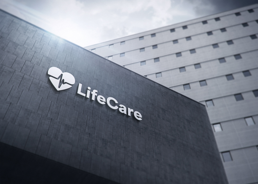
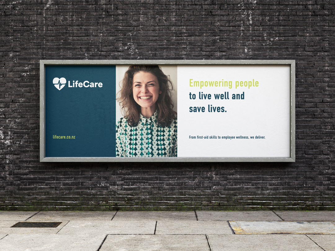
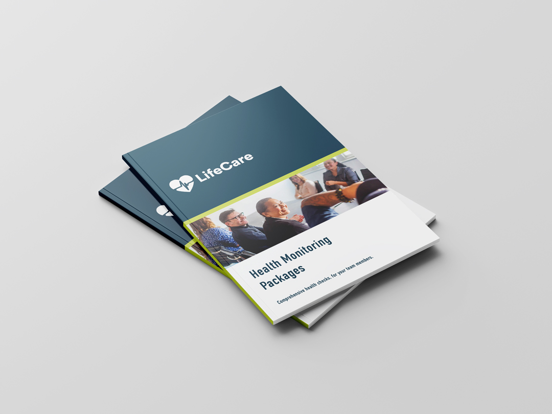
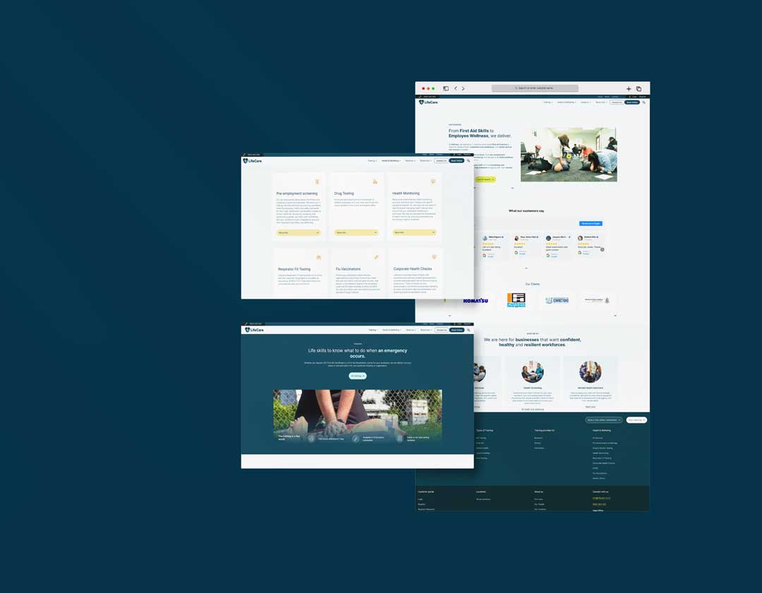
LifeCare

2025
Branding
Ui/ux
consulting
Story of transformation

/

LifeCare began in 1994, founded by Janet Brothers to provide impactful first-aid training in the New Zealand market.

Over the years, it has expanded to include health monitoring, mental health training and wellness services, employing over 100 staff, including health consultants, occupational therapists, registered nurses, nutritionists, and health care educators.

In 2023, LifeCare brought on Genesis Capital as a partner to support its next phase of growth. This partnership marked a new chapter for LifeCare, which remains dedicated to empowering people to live well and save lives. With long-term clients still onboard and a focus on innovative growth, LifeCare continues to be a trusted leader in first aid training, health and wellbeing across New Zealand.

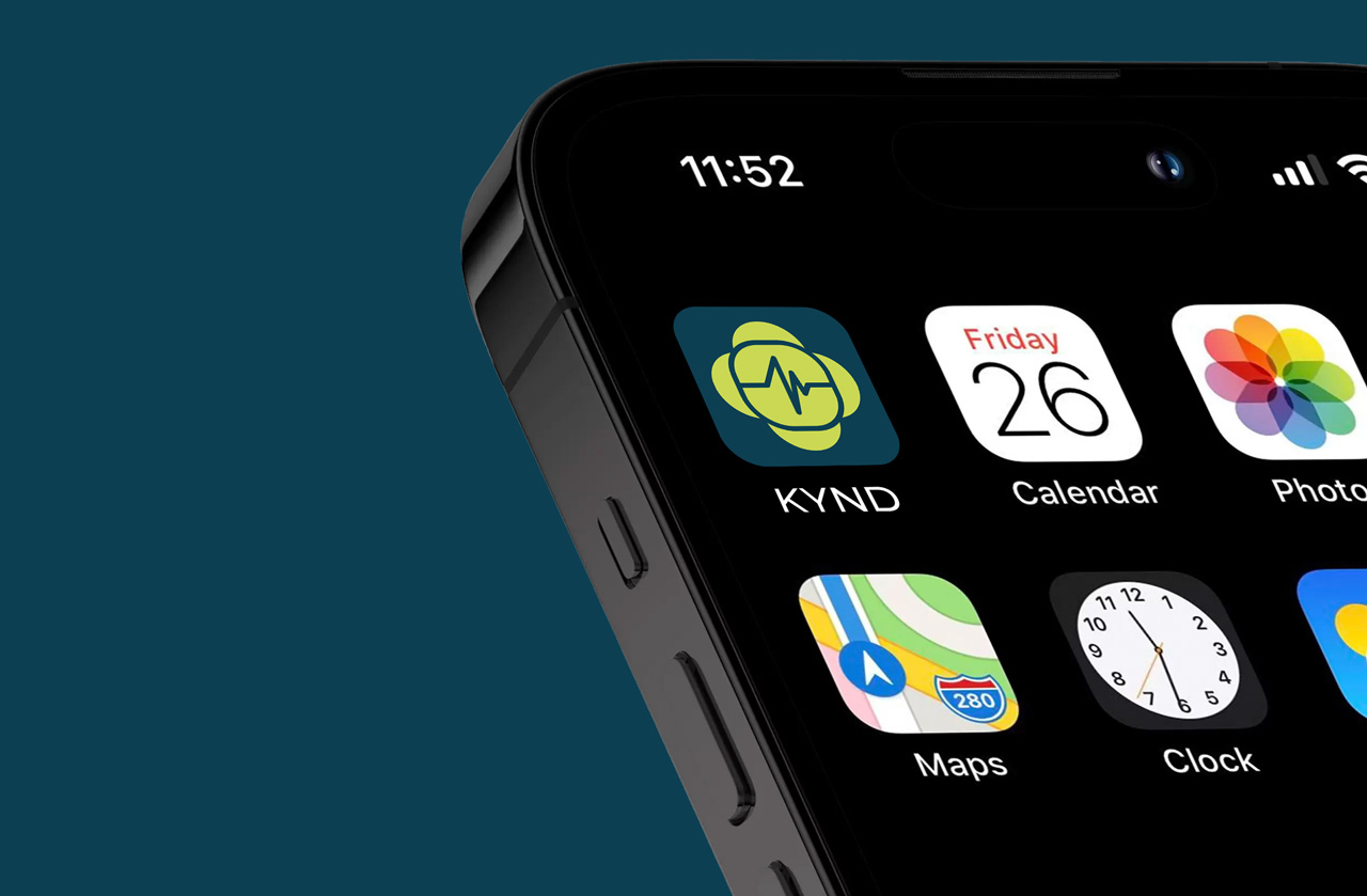
KYND by LifeCare

2025
Art Direction
branding
Ui/UX
Designing a More Human Approach to Wellbeing

/

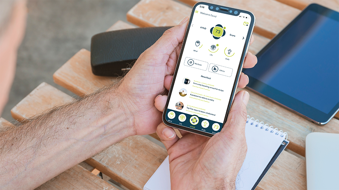
KYND presented an opportunity to reimagine how digital health tools can feel, shifting the experience from something purely functional to something genuinely supportive and engaging. The focus was on creating a product that encourages ongoing interaction, where users feel guided rather than instructed, and where wellbeing is approached as an evolving, personal journey rather than a fixed outcome.

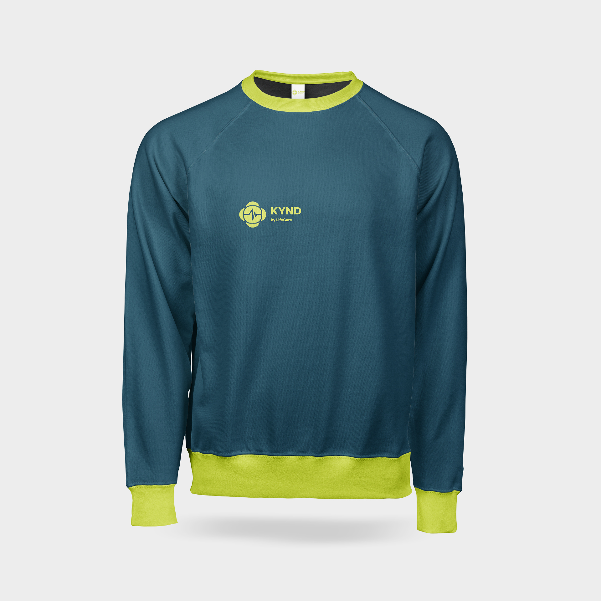
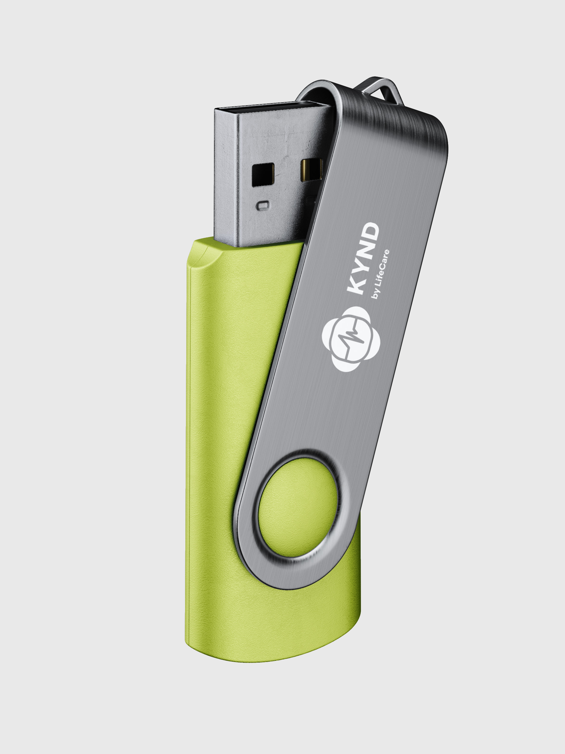
The brand identity was developed to reflect a sense of care, clarity and positivity, moving away from clinical conventions and towards a more human centred approach. This direction informed the design of the app interface, where usability and engagement were key. We crafted a visual and interaction system that supports a range of features, including personalised health assessments, stress management tools, nutrition guidance and fitness tracking. The experience was designed to feel fluid and encouraging, using thoughtful layout, clear navigation and subtle visual cues to guide users through each stage of their journey.

This project provided an opportunity to explore how design can positively influence behaviour and engagement within the health space. By combining a strong brand foundation with a carefully considered user experience, KYND became more than just a functional tool. It evolved into a platform that encourages consistency, builds trust and supports long term wellbeing. The result is a cohesive digital product that aligns with LifeCare’s broader vision while offering users a meaningful and enjoyable way to engage with their health.

Cambium

2024
Branding
Web design
consulting
Regenerative Branding

/

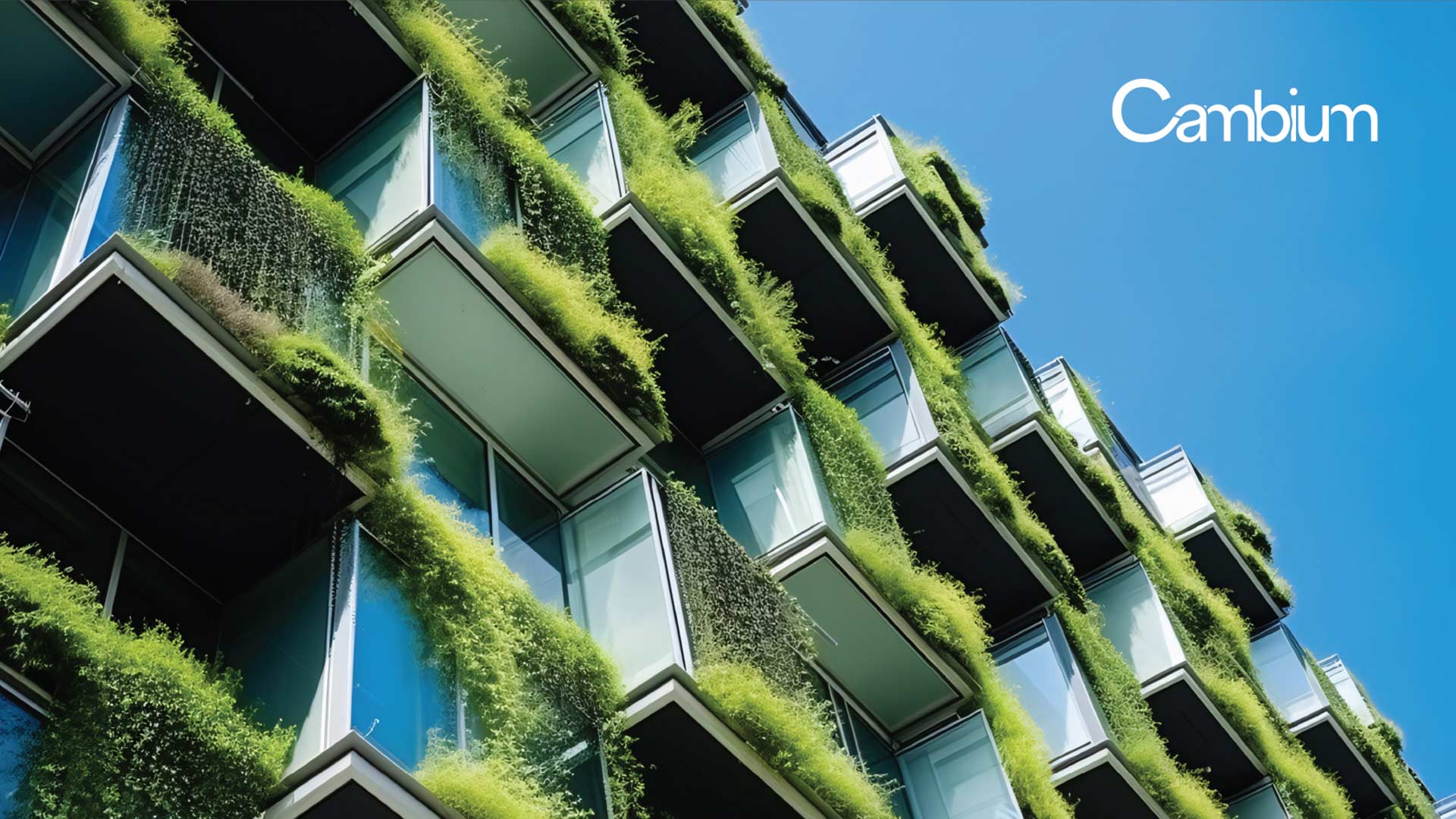
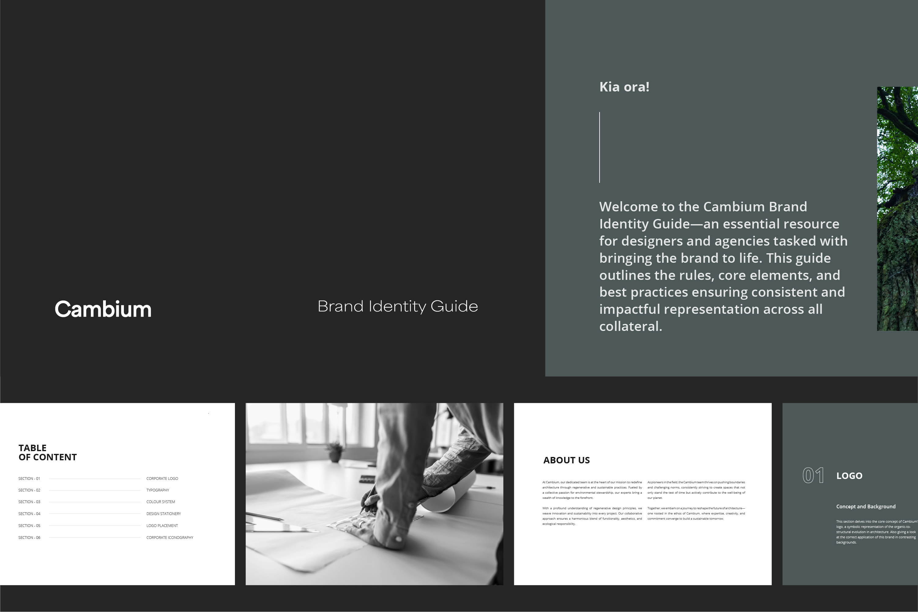
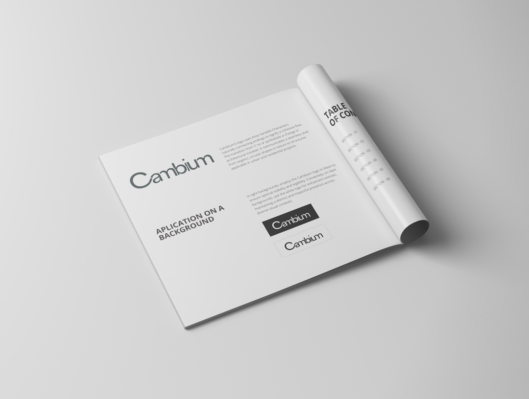
Cambium’s brand evolution was grounded in the idea of regeneration, not just as a business model but as a guiding philosophy. As a consultancy, development, investment and regeneration company, Cambium operates at the intersection of strategy, capital and long term impact. From the outset, our collaboration focused on articulating this layered role with clarity and confidence. Together, we explored how regeneration could be expressed not only in the projects they deliver, but in the way they communicate, position and present themselves. The result was a brand foundation that reflects growth, resilience and responsible progress, values that sit at the core of their work and partnerships.

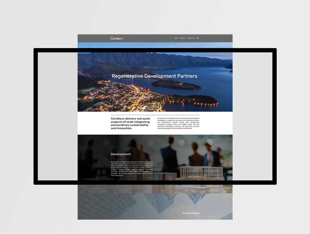
This strategic alignment directly informed the visual and digital identity we developed alongside their team. Rather than imposing an external aesthetic, we worked collaboratively to translate Cambium’s principles into a cohesive brand system. The design language draws from the concept of renewal and cyclical growth, structured, forward thinking and grounded in purpose. Every element, from typography to layout and tone of voice, was crafted to express credibility and ambition while maintaining warmth and accessibility. The online platform became a central expression of this system, a space where their expertise, projects and vision could be clearly communicated to investors, partners and communities alike.

Since launching the refreshed brand and digital presence, Cambium has experienced the tangible benefits of a well established identity. The clarity of their positioning has strengthened stakeholder engagement, elevated their market perception and created consistency across communications. Internally, the brand now serves as a strategic compass, aligning teams around a shared narrative and long term mission. Externally, their online platform functions not only as a showcase, but as a tool for growth, supporting new opportunities and reinforcing their authority within the regeneration sector. What began as a branding project has become a foundation for sustained momentum and future expansion.

Check out Cambium website: cambiumlabs.com

Pacific Power Resources

2024
Branding
Web design
Consulting
Brand Identity for Renewable Energy

/

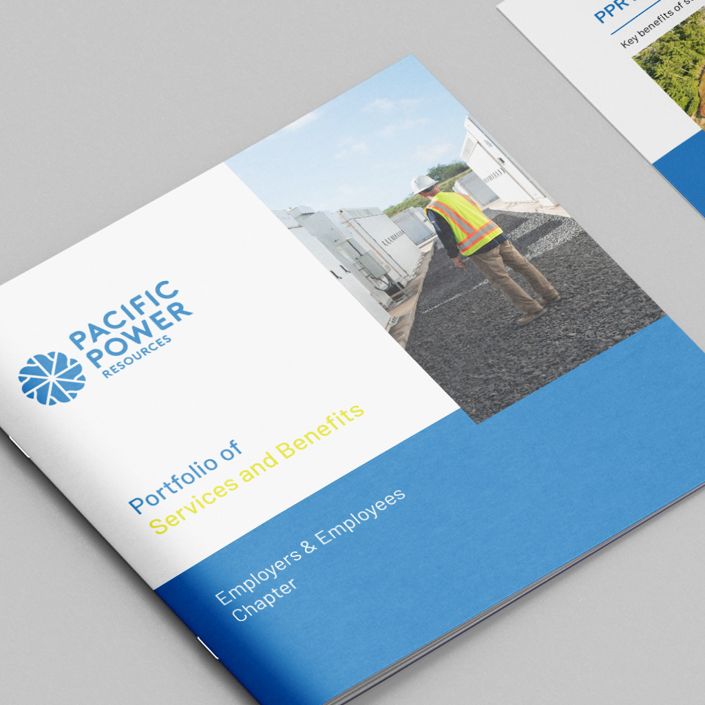
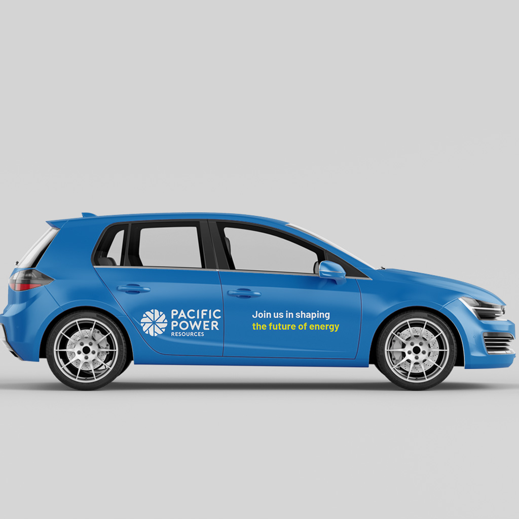
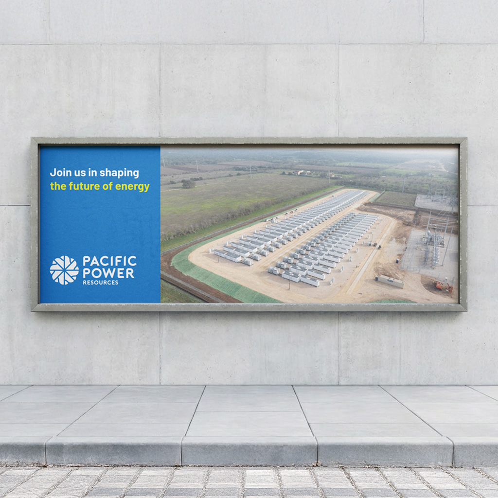
The work developed for Pacific Power Resources focused primarily on establishing a clear and professional brand identity capable of supporting the company’s presence within the energy and infrastructure sector. The objective was to create a cohesive visual language that could communicate reliability, technical expertise and long term value to partners, investors and industry stakeholders. Through a structured design process, the brand system was developed to balance clarity and credibility with a modern and approachable aesthetic.

The identity was applied across a range of core communication materials, including corporate brochures, presentation documents and supporting marketing collateral. Particular attention was placed on layout structure, typography and colour balance to ensure complex technical information could be presented in a clear and engaging way. The resulting materials provide Pacific Power Resources with a consistent visual framework that supports both internal communication and external engagement.

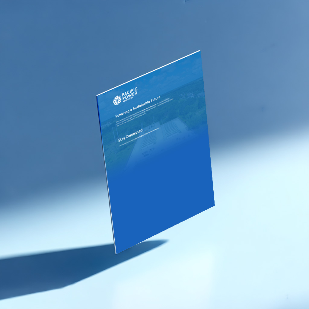
Alongside the brand development, a simple landing page was designed as a supporting digital touchpoint. While secondary to the broader identity work, the page serves as a concise introduction to the company and reinforces the visual system established across the printed and presentation materials. Together, these elements form a cohesive brand foundation that positions Pacific Power Resources with clarity and professionalism across both physical and digital platforms.

Joseph Michael

2024
pitch deck design
layout
photo editing
Crafting Compelling Narratives Through Design

/

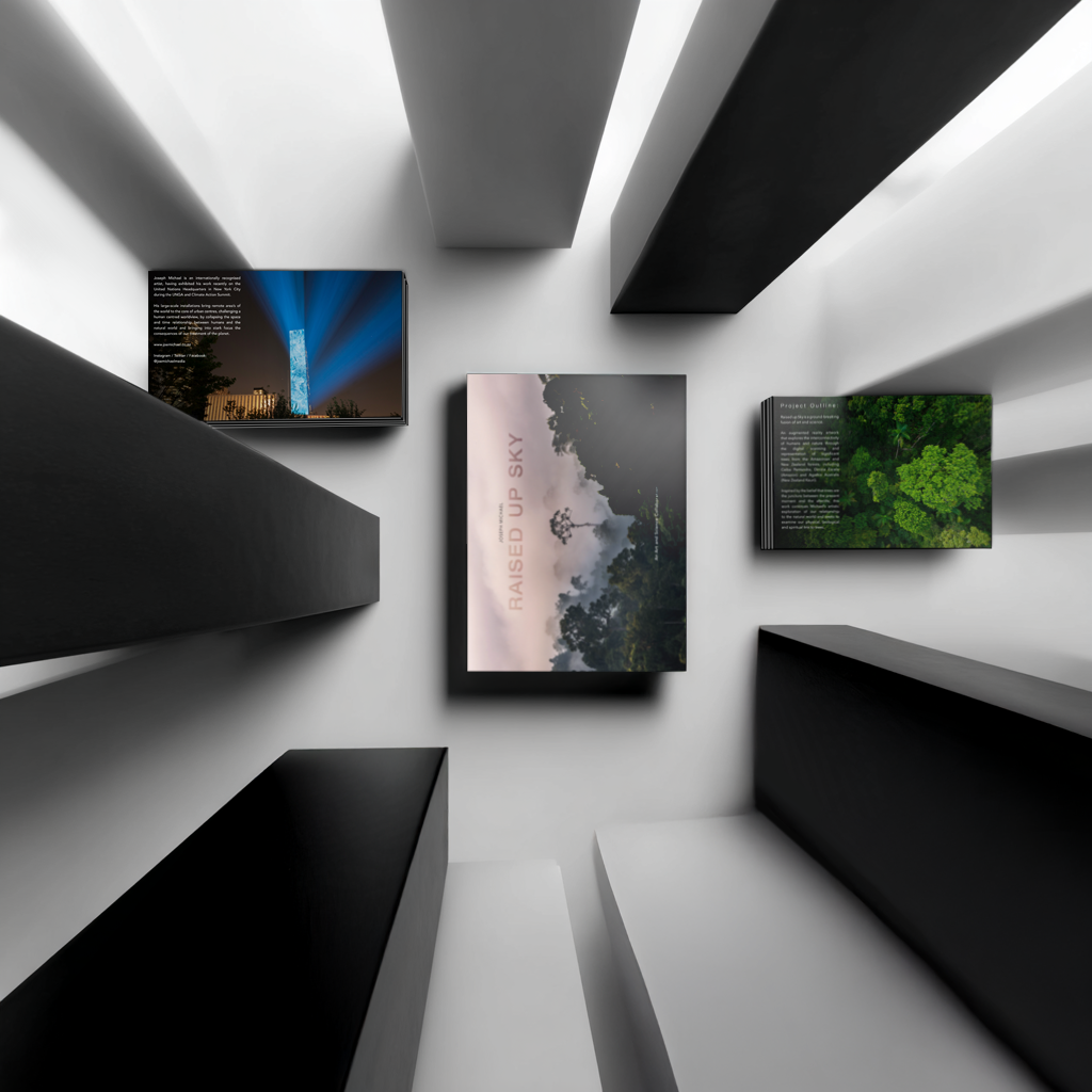
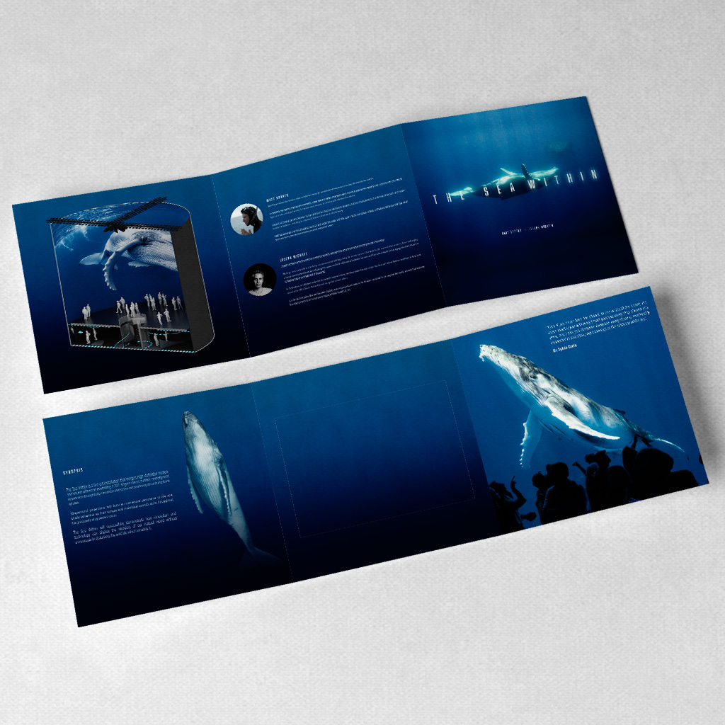
Our collaboration with Joseph Michael has centred on translating the vision behind his large scale artistic installations into clear and compelling communication materials. As an artist working across conceptual and spatial mediums, Joseph’s work often requires strong narrative support when presented to curators, institutions and potential funders. From the outset, our role focused on shaping this narrative through carefully crafted pitch decks and presentation materials that could articulate the intention, context and impact of each project with clarity and confidence.

Working closely together, we developed a series of visual frameworks that balance artistic expression with structured storytelling. The pitch decks were designed to guide audiences through the conceptual foundations of each installation while also addressing practical considerations such as scale, feasibility and cultural relevance. Rather than treating these materials as purely informational documents, the design approach sought to reflect the atmosphere and conceptual depth of the work itself. Typography, pacing and composition were used to support the narrative and allow the projects to unfold in a way that feels both engaging and accessible.

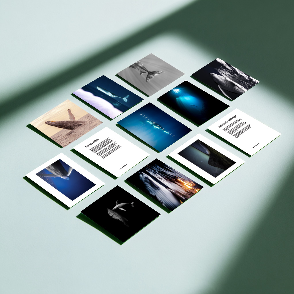
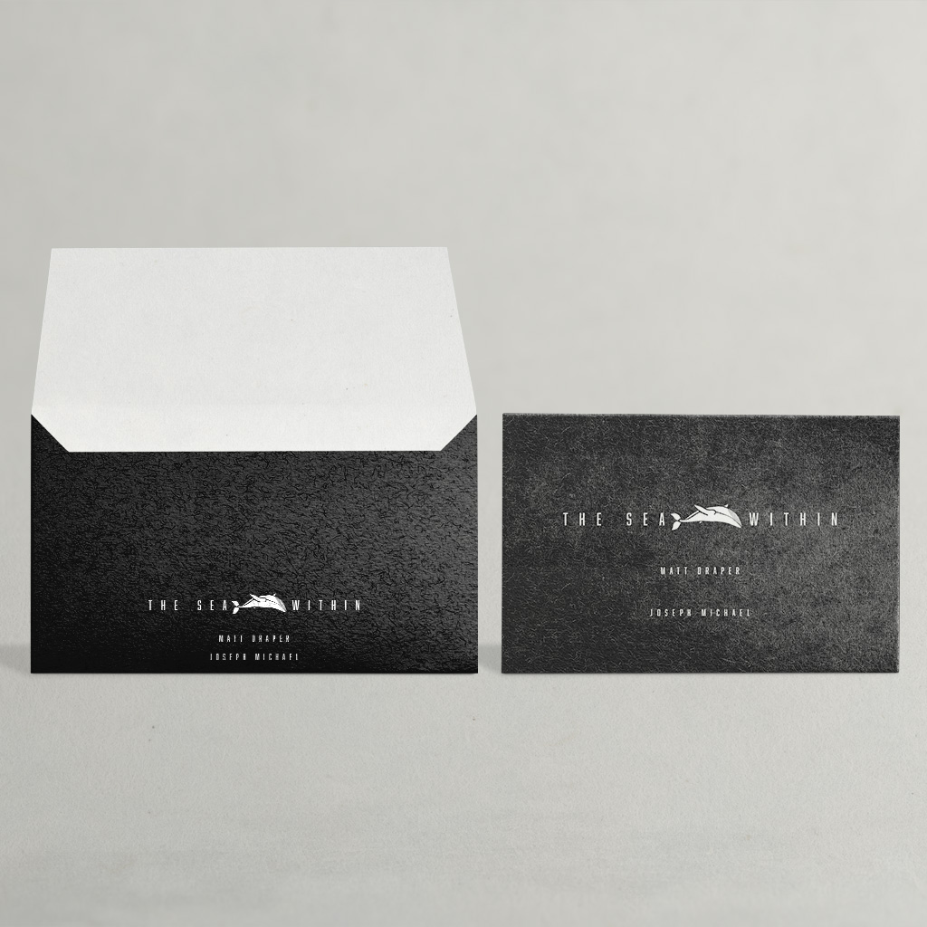
Alongside the presentation materials, we produced a range of printed collateral including brochures, postcards and supporting documentation used across exhibitions, proposals and public engagement. Each piece was designed to extend the visual language established in the decks, creating a consistent and recognisable identity around Joseph’s work. This cohesive approach ensures that whether the audience encounters the projects through a formal funding proposal, exhibition material or promotional print, the communication remains aligned with the intent and tone of the installations.

Through this ongoing collaboration, the design work has become a key tool in supporting the development and presentation of Joseph’s projects. By transforming complex artistic ideas into clear and thoughtful visual communication, these materials help bridge the gap between concept and realisation, enabling the work to connect with partners, institutions and audiences while strengthening its potential for future opportunities and support.

Auckland Climate Festival

2023
Art Direction
branding
graphic systems
Ngaa Hua o Wai
The benefits of water

/

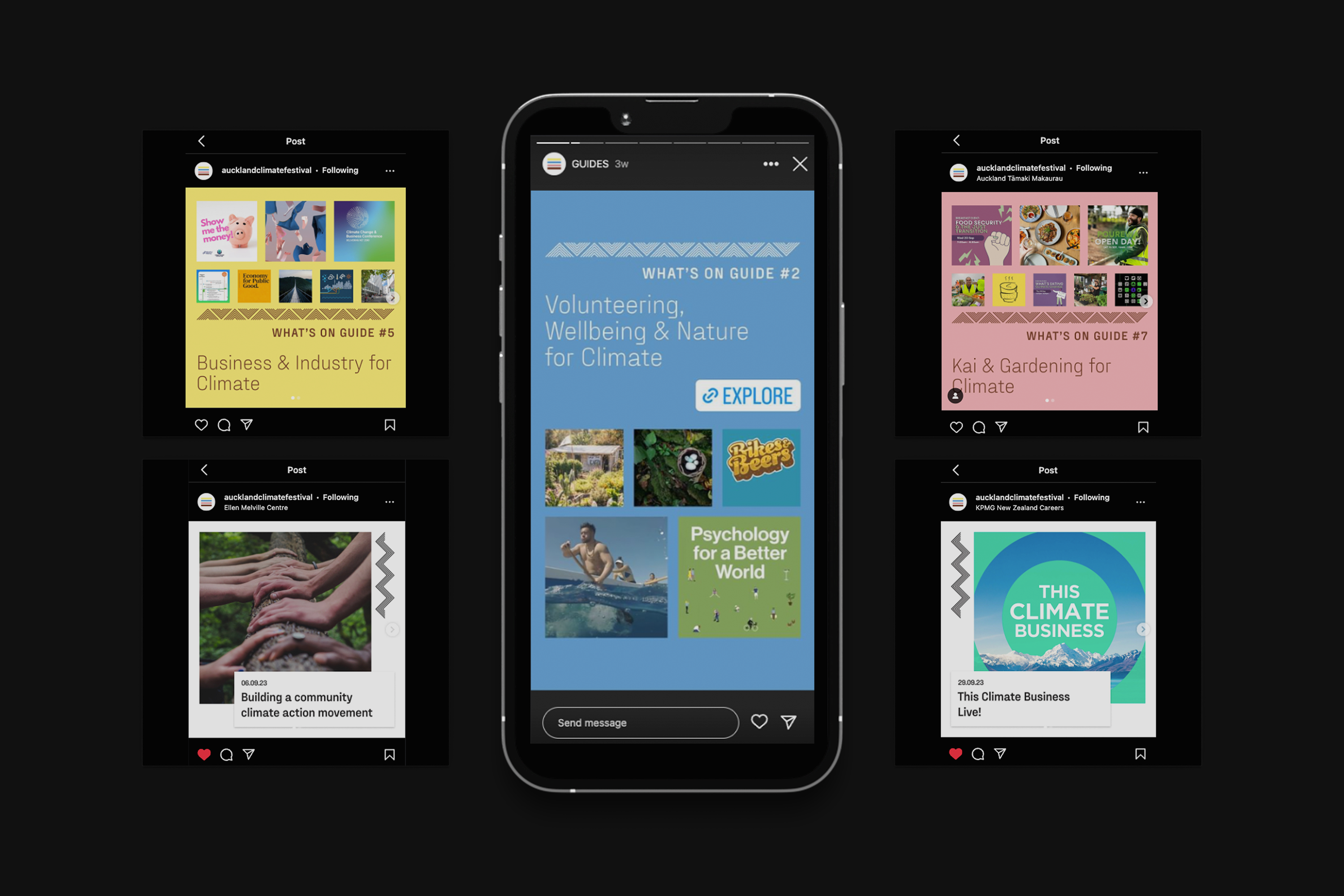
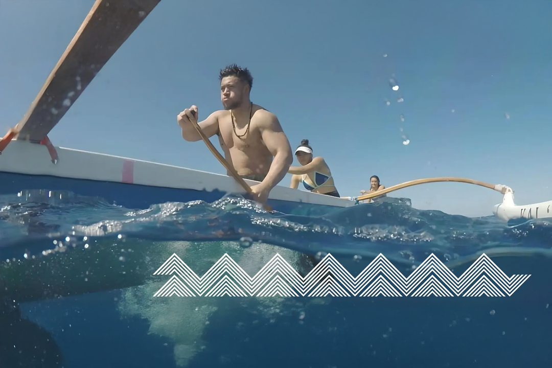
The 2023 Auckland Climate Festival was shaped around Wai (water) as its central theme, positioning it as both the starting point and connective force for climate awareness and action. Water was chosen not only because of its critical role in climate systems, but because it is an element New Zealanders—Kiwis and Māori in particular—are deeply connected to through geography, culture, and daily life. Surrounded by oceans, rivers, lakes, and rain, Aotearoa understands water not as a distant resource but as a living presence. In te ao Māori, wai is a taonga: life-giving, relational, and inseparable from wellbeing. The festival used this understanding to remind audiences that what we are most connected to is also what we are most responsible for protecting.

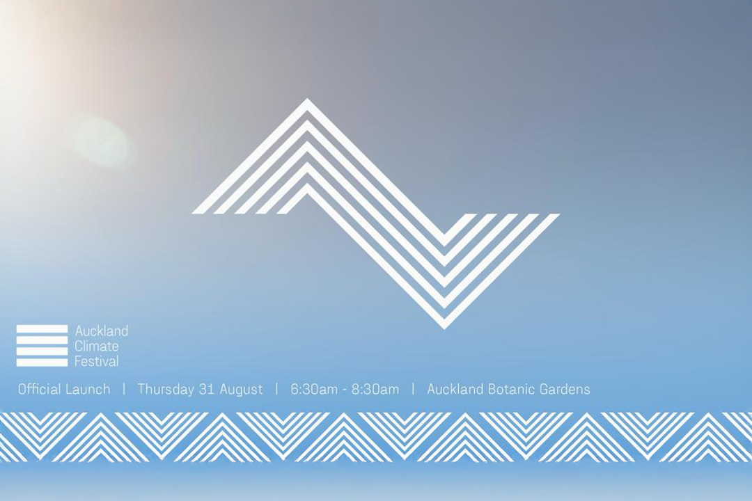
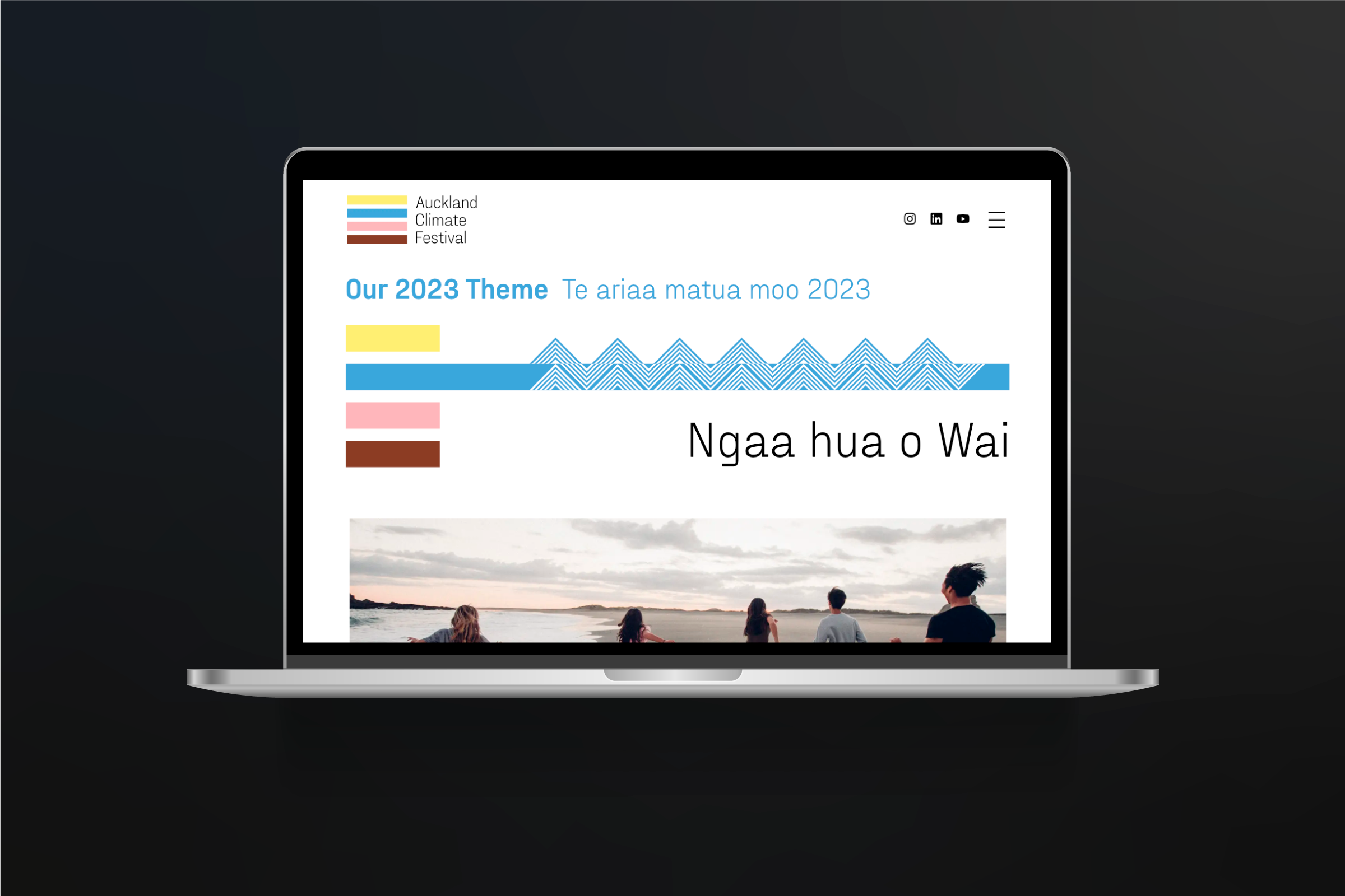
This conceptual foundation directly informed the festival’s graphic and visual identity. The design language drew from patterns, forms, and rhythms found in Te Ao Māori, not as decoration, but as a system of meaning and interconnectedness. These visual structures echo natural flows—currents, ripples, layers, and cycles—reflecting how water moves through land, ecosystems, and communities. The festival branding embraced this interconnected worldview, reinforcing the idea that climate action is not isolated or linear, but layered, collective, and continuous, much like wai itself.

Within the branding system, colour stripes were used to represent different phases and dimensions of climate action, creating a clear yet flexible visual framework. Among them, the blue stripe emerged as the most prominent, acting as the visual and conceptual anchor to the water theme. This blue connection informed the development of graphic icons and patterns, which revolved around flow, continuity, and transformation. Together, these elements created a cohesive identity that translated the festival’s purpose into a visual language—one that made water not just a topic of discussion, but the lens through which climate action, responsibility, and collective care were understood.
"Design removes complexity. Clarity over cleverness. Systems over decoration. Timeless over trendy."
Our conviction. Since 2020.
We believe the best design is invisible — not because it hides, but because it fits so precisely that it stops being noticed as design and becomes simply true. Good design requires restraint. The willingness to remove rather than add. The confidence to trust that a single well-considered decision is worth more than a dozen decorative ones.

Our services

Systems, not deliverables.
Every engagement begins with understanding the organisation — its ambitions, constraints, and character — before any design work is considered.

identity

read more

Brand strategy, visual identity systems, mark design, typography, colour, and brand guidelines built to last thirty years.

Digital

read more

Web development, digital design systems, interface design, and considered web presence for organisations with high standards.

Creative Direction

read more

Art direction, photography direction, editorial design, and campaign development for organisations that understand the value of a consistent voice.

Partnership

read more

Long-term retainer relationships with select clients who value continuity, institutional knowledge, and a studio that thinks alongside them.

We don't believe good brands are invented. They're uncovered. Through clarity. Through restraint. Through the courage to become something more honest than before.
Founded in Auckland.

Working globally.

Independent since 2020.
The36th exists to help organisations at moments of change.
Sometimes that change is a new business.
Sometimes it's growth.
Sometimes it's recognising that the identity they've outgrown no longer represents where they're going.
Our role isn't to decorate that transition.
It's to give it clarity.
Working together
We are looking for clients who understand that good design is a conversation, not a transaction.
The best engagements we have had share a quality that has nothing to do with budget or scope. The clients showed up for the hard conversations. They trusted us enough to push back, and we trusted them enough to be honest. That is the foundation every good project needs.