![[background image] image of office workspace with desks (for a film production company)](https://cdn.prod.website-files.com/68995c2cb63b535f9711d993/69bb6b617679beb3341407c4_Billy-at-KES-scaled_Web36.jpg)
Pacific Power Resources approached us with a strategic vision to craft their brand identity and online precense. They aimed to create a cohesive brand image that resonates with their target audience while creating their first digital touchpoint to expand their reach and engagement.
Pacific Power Resources approached us with a strategic vision to craft their brand identity and online precense. They aimed to create a cohesive brand image that resonates with their target audience while creating their first digital touchpoint to expand their reach and engagement.
Pacific Power Resources approached us with a strategic vision to craft their brand identity and online precense. They aimed to create a cohesive brand image that resonates with their target audience while creating their first digital touchpoint to expand their reach and engagement.
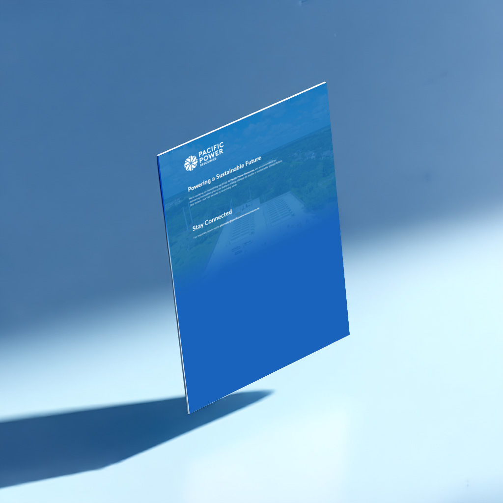
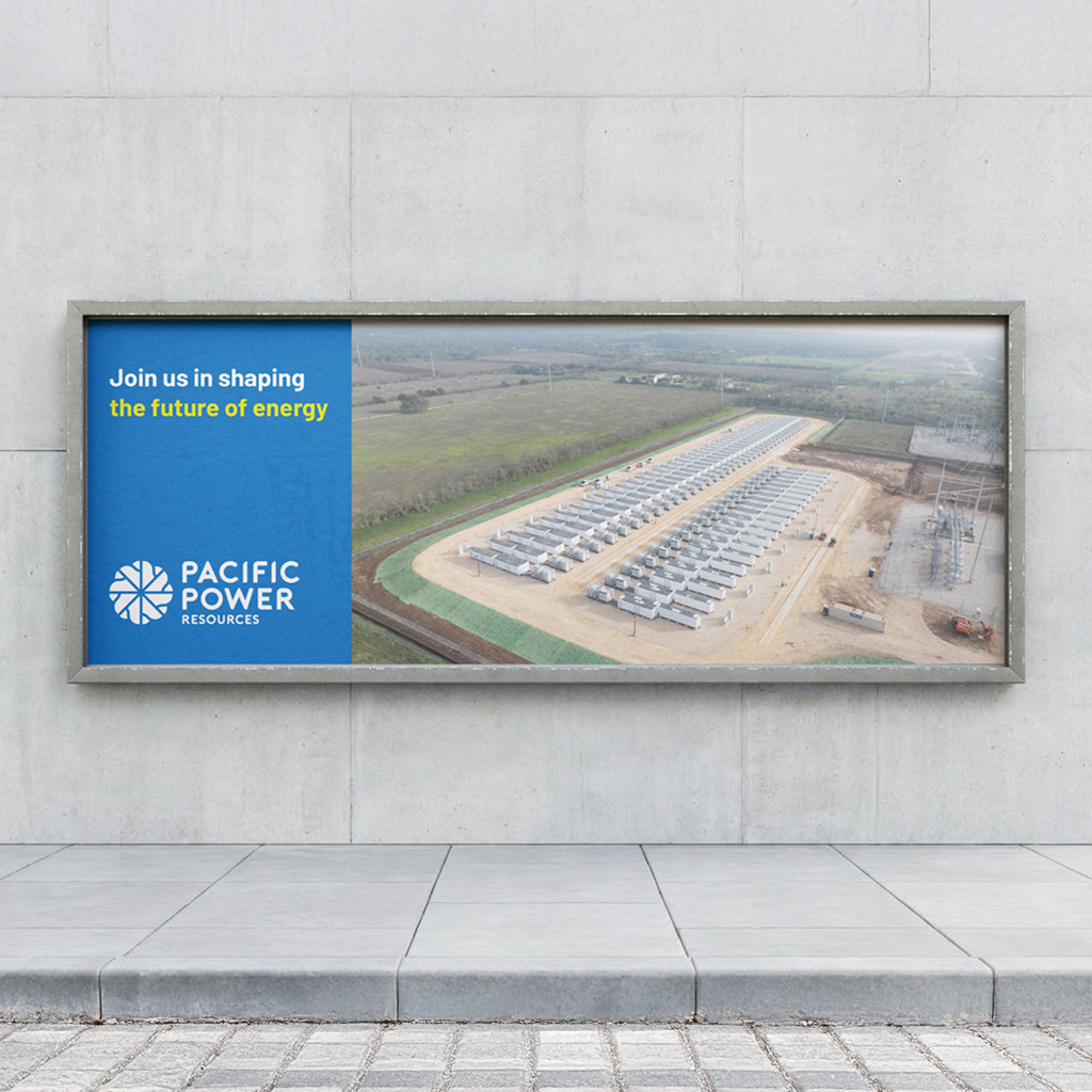
The work developed for Pacific Power Resources focused primarily on establishing a clear and professional brand identity capable of supporting the company’s presence within the energy and infrastructure sector. The objective was to create a cohesive visual language that could communicate reliability, technical expertise and long term value to partners, investors and industry stakeholders. Through a structured design process, the brand system was developed to balance clarity and credibility with a modern and approachable aesthetic.
The identity was applied across a range of core communication materials, including corporate brochures, presentation documents and supporting marketing collateral. Particular attention was placed on layout structure, typography and colour balance to ensure complex technical information could be presented in a clear and engaging way. The resulting materials provide Pacific Power Resources with a consistent visual framework that supports both internal communication and external engagement.
Alongside the brand development, a simple landing page was designed as a supporting digital touchpoint. While secondary to the broader identity work, the page serves as a concise introduction to the company and reinforces the visual system established across the printed and presentation materials. Together, these elements form a cohesive brand foundation that positions Pacific Power Resources with clarity and professionalism across both physical and digital platforms.